

This is a guest post from StoreMaven, the leading App Store Optimization platform. The information in this post is based on thousands of tests and over one billion data points collected by the StoreMaven platform.
The Role of the App Stores in the First User Journey
With more marketing budgets poured into mobile than ever before, the cost of acquiring new installs is soaring. Today, the biggest barrier to success in the app universe is reducing these costs. Taking on the challenge, growth experts have learned to invest heavily in the “first user journey.” From carefully crafting the message in ads, to guiding users as you introduce them to the usability and value of your app.
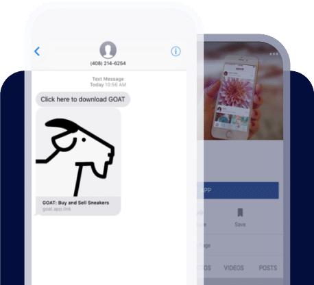
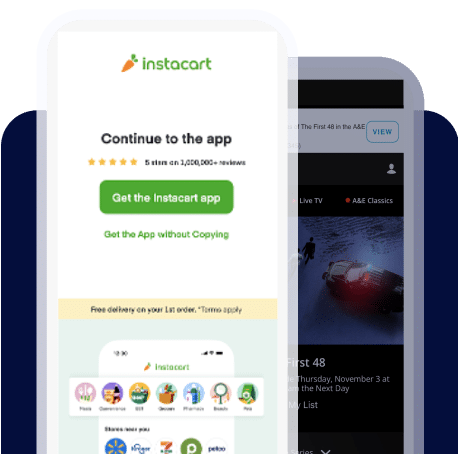
The app stores are a crucial part of the first user journey. There’s so much money and effort put into getting people to install your app. The most irritating thing (as a developer) is when people get as far as viewing your app store page and then decide that it doesn’t meet their needs. The reality is that the majority of potential installers drop in the app store. Incoming visitors from paid media, viral channels, organic discovery and more, all begin their journey with your app in the store and are all impacted by the way the app is presented there.
As such, a better version of your app store page can double your conversion rates.
The key to finding a better version is to continuously test your app store page with creatives that best align with your audience expectations.
But where should you start? In this post we’re going to introduce 3 app store A/B tests every developer must run.
Getting To Know Your Users
The process of designing the optimal app store page begins by answering the following question: “What might drive our potential users to install our app and use our product?” The methodology behind the process is called Design Thinking, a method focused on gaining user empathy across every step of the funnel. Only after you identify the decision process your users go through, can you create a user journey that will maximize install conversion.
[cta id=”702″]
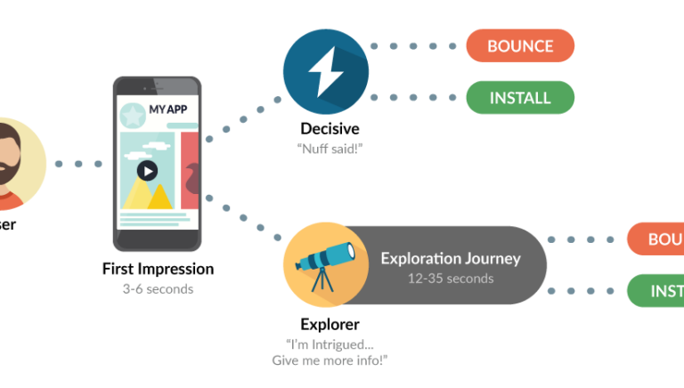
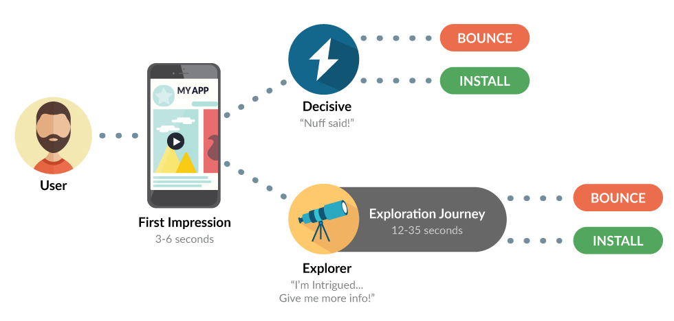
People that visit Google’s Play Store or Apple’s App Store, are segmented into 2 general groups:
- Decisive visitors: This group does not engage with the app store before deciding to install or leave. Decisive Visitors represents 60% of all app store traffic.
- Explorers: The remaining 40% of the visitors engage with the content available on the store to make a more informed decision before installing or leaving
The first impression given by your app store determines how many of your store page visitors will fall under each group. And a good app store page is one that has high install conversion rates for both decisive users and explorers.
 ASO Begins With Optimizing The Store’s First Impression
 ASO Begins With Optimizing The Store’s First Impression
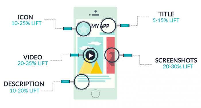
Once visitors land on your app page, they take a quick glance (3-6 seconds) at the content that is visible in your first impression, and then make a decision of whether to install, drop, or consume more content.
When designing your next app store page, your job is to:
- Maximize decisive and explore install rates
- Get visitors to engage with your content before making a decision whether to install or not
Research with top developers (cross-industry) shows that exploring installers present higher KPIs (second day retention 5-15% above instant installers), and are more likely to convert into paying users.
The Difference Between The App Store And Google Play’s First Impression
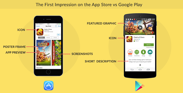
In both stores, the first impression is comprised of the creative that visitors see the moment they land on the app page. These marketing assets are the key drivers, not only for the install conversion rate, but also for the quality of your installs.
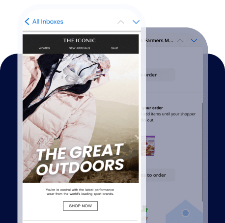
On iOS, the screenshot gallery is most dominant and is “above the fold,” while on Google Play the gallery is “below the fold,” making the top feature graphic and the short description key elements of the first impression.
3 First Impression ASO tests
1. Icon Testing: The icon plays a significant role in the App Store Marketing funnel. Some developers choose to have different icons on each store.
Optimizing your icon drives growth, improving:
-
- App Discovery – The icon is your greatest ambassador on the app stores, and as such, has a significant effect on your app’s organic traffic volume. Optimizing your icon means more app page visitors and more users installing directly from the top charts / app lists on the App Store and Google Play.
- App Install Rate – As a key element in the app page first impression, it directly affects both your organic and paid app page conversion rate. Our research on app store engagement (measuring over 50 million app store visitors), found thata better version of your icon can increase conversion rates by 25%.
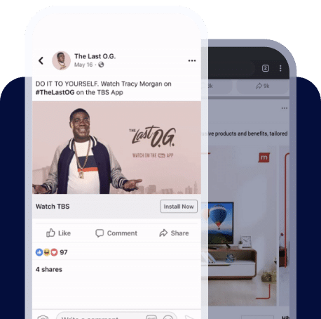
2. Video vs. No Video: The visual richness of videos offers a great medium for delivering messages that often don’t come across as well through text and static images. With an App Preview or Play Store video, you have the potential of educating users to understand your value propositions and to present a more accurate simulation of your app’s experience. And most importantly, to get viewers excited about your product. Similarly to an optimized icon, our research shows that video can either increase or decrease your conversion rates by 25% and up.
Adding a video has several implications to it which must be taken into account:
-
- Localization: If your app supports multiple languages, you should take into account that Apple doesn’t allow localizing videos per geo. Therefore, despite all benefits a video can provide, using a generic video for all languages can suddenly turn into a curse disguised as a blessing as conversion rates can drop due to the fact that it’s not localized.
- Exploration Journey: Adding a video affects the whole exploration journey of your store visitors. In iOS stores for example, videos often shift explorers’ attention to watching the video instead t of other exploration actions (mainly scrolling the screenshot gallery).
- First Impression: On iOS, adding a video has an even bigger implication on your first impression and presents a major challenge. Your poster frame pushes your image gallery to the right making your second screenshot not visible in your first impression.
Essentially, your poster frame acts as your first screenshot, becoming one of the most impactful elements on your page as it dominates the first impression.
If you don’t select your poster frame wisely (test it!), you’re likely to see decreased conversion rates for decisive visitors. Make sure to think about a poster frame that can deliver a meaningful message as you begin producing the video.
To learn all about how to get your app store video right, and get to know some video benchmarks, make sure to read this post.
3. First two screenshots (iOS) / Feature Graphic (Google Play): The majority of your store visitors don’t swipe past your first two screenshots on iOS or scroll down the page on Google Play. That makes Apple’s first two screenshots and Google’s feature graphic the most important app store elements. Here are our inputs for designing variations that make a test significant.
-
- Messaging: Identify the most important messages you should convey to your users, and test them all to find your best first impression. For example, utility apps might focus on the following messages for their first impression:
- Social Proof – “The most downloaded to-do app!”
- Key Distinctive Features – “Assign to-do’s to friends”
- Ease of use- “Easily manage any task”
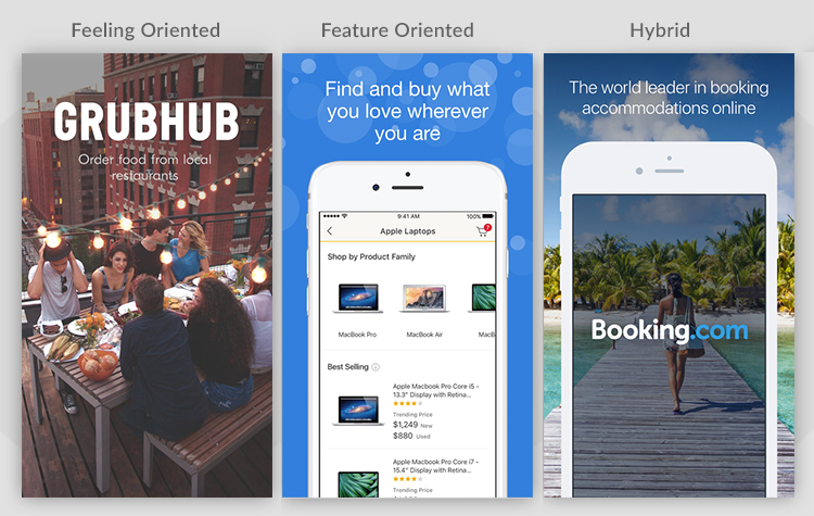
- Design: There are several trending approaches for designing screenshots:
- Feeling-oriented: Using lifestyle images or visuals that are more similar to ad banners can often do a better job conveying the value of your app. Such screenshots tend to draw a stronger emotional connection to the brand and product. It’s strongly recommended to test out, especially if the UI of the app is not necessarily where the app’s competitive edge lies.
- Feature-oriented: Real screenshots of the app explain the different features and highlight unique selling points. Make sure to help visitors focus on the relevant parts of the UI and enforce the connection between the textual caption and visual so they quickly understand the image and don’t get lost in the clutter. If your UI is exciting, or a key differentiator in your app’s category, this approach may resonate well with your target audience.
- Hybrid: A mix of both approaches, highlighting features over a contextual background, or simply switching off between feeling-oriented images and feature-oriented in one set. This style of design can often offer the best of both worlds – an engaging image that draws curiosity, and an accurate visual representation of the app to showcase its functionality.
- Messaging: Identify the most important messages you should convey to your users, and test them all to find your best first impression. For example, utility apps might focus on the following messages for their first impression:
 Setting Your Test For Success
 Setting Your Test For Success
Okay, so now that you have a testing agenda and guidelines for crafting impactful variations – what else do you need to get right for successful testing?
There are three principles to keep in order to have valuable results and to enjoy an actual CVR lift.
- Designing tests with high potential for reaching 95% confidence level
- Choosing the right traffic source that will impact both paid and organic users
- Understanding how to analyze app store engagement (ASE) metrics to draft a yearly test plan
Interested in more info? Make sure to read our full App Store Marketing Guidebook that will walk you through all there is to know about ASO.
StoreMaven invented the only way to AB test App Store and Google Play marketing assets.

The world’s top mobile companies rely on StoreMaven to optimize their app stores and install conversion.