
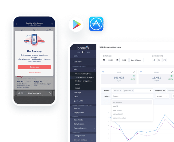


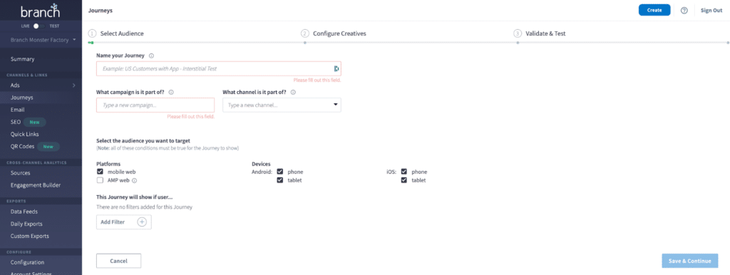
Mobile smart banners like Branch’s Journeys are a highly effective web-to-app acquisition solution. A personalized smart banner experience helps you acquire users who visit your mobile website, whether they come from paid or organic channels. Mobile smart banners are a powerful solution to drive new app users via your website without completely relying on expensive app install ads.
For brands with significant mobile web traffic, Journeys smart banners are the perfect solution to turn those web visitors into loyal, repeat app customers. In fact, app users are twice as likely to buy and return to the app (source: Branch research).
However, the biggest impact of smart banners comes from optimizing them. So let’s dive a little deeper into Journeys’ best practices.
Journeys are really smart smart banners
Journeys are powerful smart banners that enable you to target mobile website visitors with a personalized experience. This experience seamlessly brings visitors to the app, even after install. With Journeys, you can easily create multiple design variations, personalize messaging, and promote sales and events.
Leveraging Journeys smart banners is an effective and inexpensive strategy to turn your existing web traffic into valuable and loyal app customers.
For example, assume your upcoming holiday campaign consists of an email campaign, push notifications, paid ads, and SMS. It’s very possible you won’t be able to reach your desired app users across all of those channels. Smart banners can help fill that gap by capturing organic mobile website visitors and converting them to app users. Plus, Journeys smart banners can target web visitors coming from your holiday campaign who don’t currently have your app installed.
Personalizing the Journeys user experience can increase click-through rates sixfold compared to a standard web banner. Below, we take a look at some of the best practices that can help you optimize your smart banners.
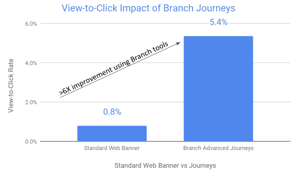
Source: Branch
Audience targeting is the critical first step
When initially planning your smart banner strategy, the number of targeting possibilities can be overwhelming. So where to start? It’s helpful to think about three general audiences, corresponding to their stage in the conversion funnel.
Typically, you should use a lighter touch with low-intent users at the top of the funnel. As users progress down the funnel, more pronounced and consistent engagement is more welcome — and can tip the scales toward conversion!
Here are a few rules of thumb for each stage of the funnel.
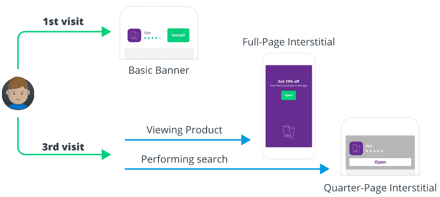
Top of funnel
Typically, we recommend using a smaller, less intrusive banner for low- or unknown-intent web visitors. Targeting ideas include a floating button or standard top or bottom banners that target first-time web visitors, non-app visitors, or infrequent visitors.
Middle of funnel
Banner choices should be a little bolder, like a quarter-page or half-page interstitial, for visitors who are further down the funnel but may not be ready to buy. You might consider targeting those who have visited your website more than three times or landed directly on a specific product page instead of the home page.
Bottom of funnel
Your highest-intent visitors are interested in interacting with your business. They might have already made a purchase, installed the app, or created an account. At this point, show a full-page interstitial — most likely, visitors at this stage won’t be scared away.
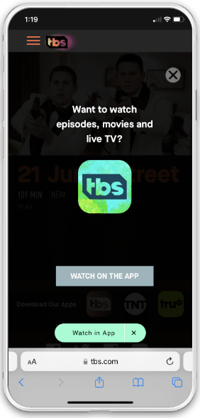
Keep in mind that the smart banner’s size can have an impact on your SEO rankings. So while it might be tempting to just go with a full-page banner at the top of the funnel, make sure you understand the ramifications. You can still have significant success with a top or bottom banner, especially if you offer a promotion to install your app. Then, progress to full-page interstitials as users show more intent. We will share more on this later.
Get creative with your design
Smart banners perform most successfully when they fit the look and feel of your website and catch users’ attention.
Here’s how to make the most of your custom banner.
Match the look and feel of your brand
Leverage the style guide from your marketing team to use custom HEX colors, Google fonts, Branch’s image size recommendations, and more. This makes the banner feel like a native element of your website and helps visitors feel comfortable clicking through your banners.
Test creatives across banner types and placements
Typically, overlay banners perform better than inline banners (which can blend into your webpage). Per our previous recommendation, banner size can also impact SEO and conversion performance, so it is worth experimenting with different banner designs.
Keep things simple
Many websites have floating chat buttons, email signup forms, and other dynamic and static elements that compete for a user’s attention and crowd the optical field. Don’t do that. Think about the user experience. Instead, ensure all your website elements, including smart banners, work together to enhance the user journey and drive app events.
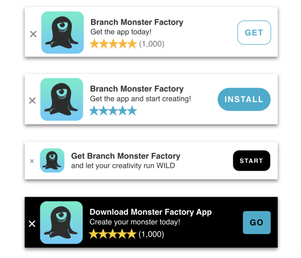
Remember, copy matters
Standard smart banners offer a default call-to-action (CTA) depending on whether the user has the app installed. However, Journeys smart banners offer the flexibility to customize much of the copy users see. Don’t underestimate the power of your CTA button and headline wording! Contextual, inviting, and unique copy can encourage users to take the next step of installing your app through the App Store or Play Store.
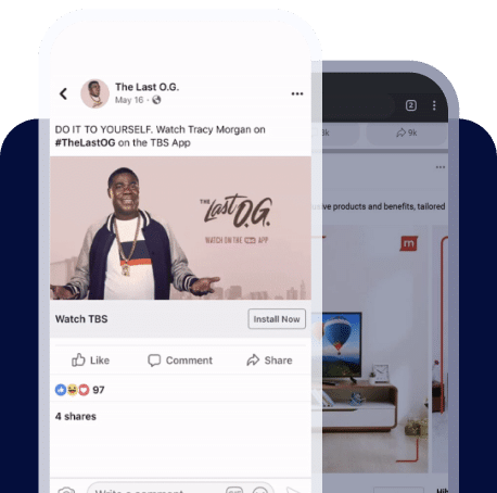
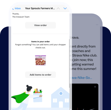
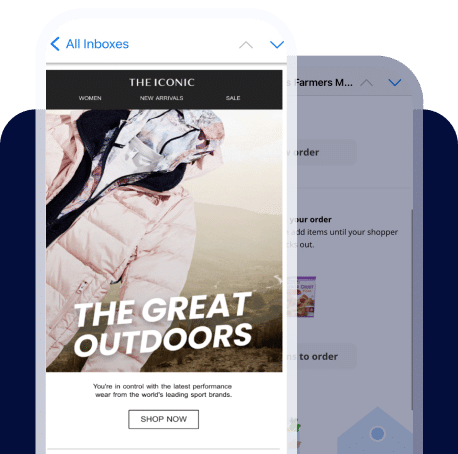
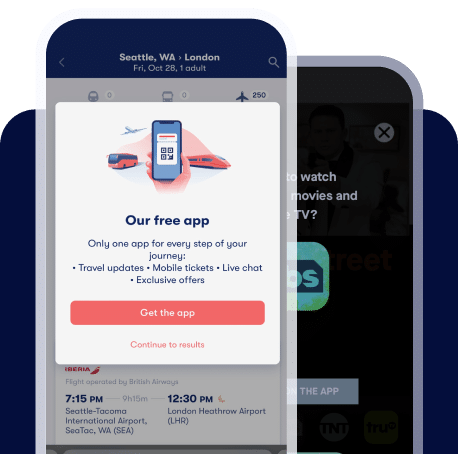
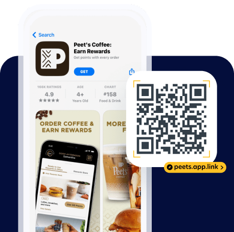
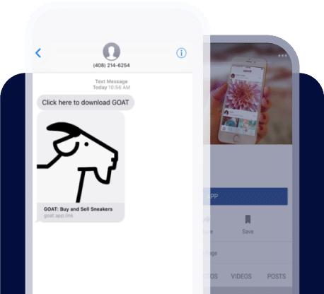
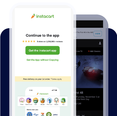
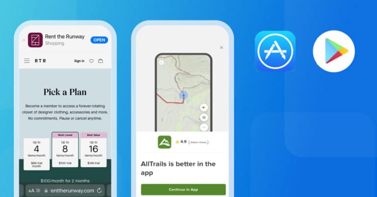
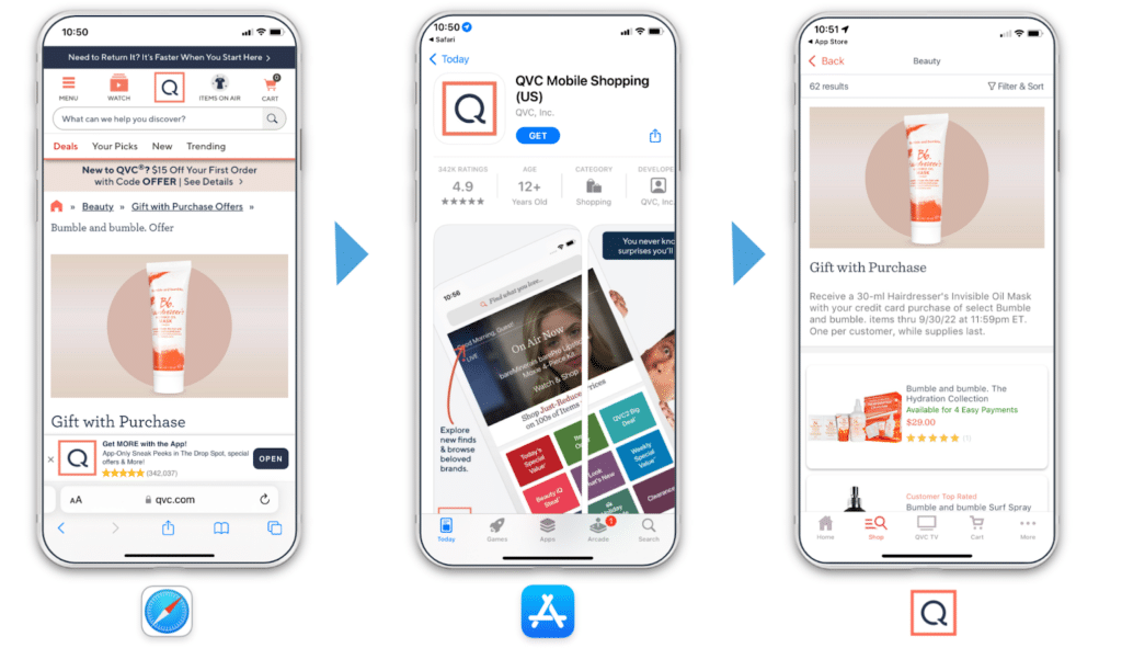
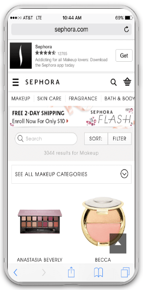
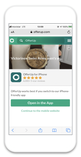
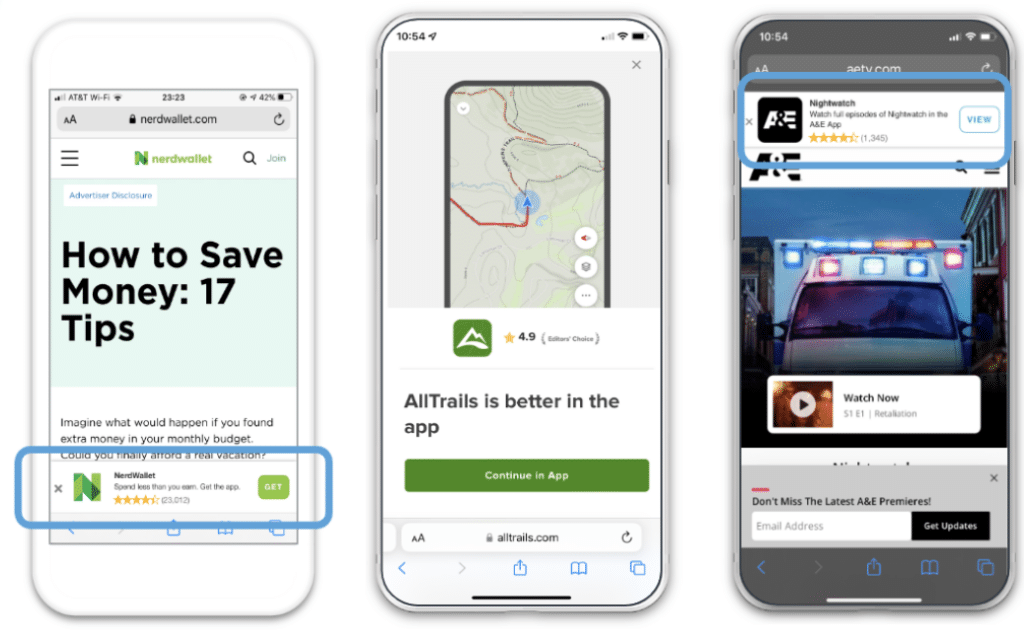
Here are some great smart banner examples:
You can also easily and dynamically localize any smart banner text by configuring your settings to read the browser’s language.
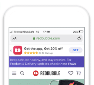
Make the app install worth it
Getting web visitors to install your app is always tricky. As a marketer, you know how much value your app holds for the user. But how do you impart that knowledge to the user? It would be great if it was as easy as writing convincing website copy, but that is not usually enough. Sometimes you have to incentivize the user.
In our experience, the most successful smart banner campaigns will offer a carrot to the user — a discount, extra reward points, or a free item — in exchange for installing the app. It could be as simple as exclusive content that can only be viewed in the app.
Whenever possible, make sure your incentive to download your app is as strong as possible.
Don’t forget to test your smart banners
Now that we’ve considered a variety of options to enhance your mobile smart banner strategies, I’ll leave you with one important reminder: A/B testing is your friend! To truly optimize your banners for your audience, change one element at a time, compare enhancements to a static baseline, keep what’s working, and ditch what’s not. Be creative. You never know what will resonate with users and move the needle.
Items you could test:
- Banner size, text colors, and placement
- Button colors and CTA
- Type of offers (i.e. Free Shipping or 10% off)
- Banner behavior when scrolling (i.e. sticky or rolling)
We encourage using and testing interstitials as part of an iterative process, using custom designs, placement tests, copy tests, offer tests, and segmentation.
Let Branch Journeys drive your app growth
Getting users to your app can be a challenge. Journeys smart banners offer web visitors a seamless pathway into your app and can turn your mobile website into your largest source of app installs.
Journeys smart banners make it easy to drive new app users via your website, without relying solely on expensive app install ads. To get started, explore Journeys in the Branch Dashboard, contact us, or get inspiration from the largest collection of mobile web-to-app banners.